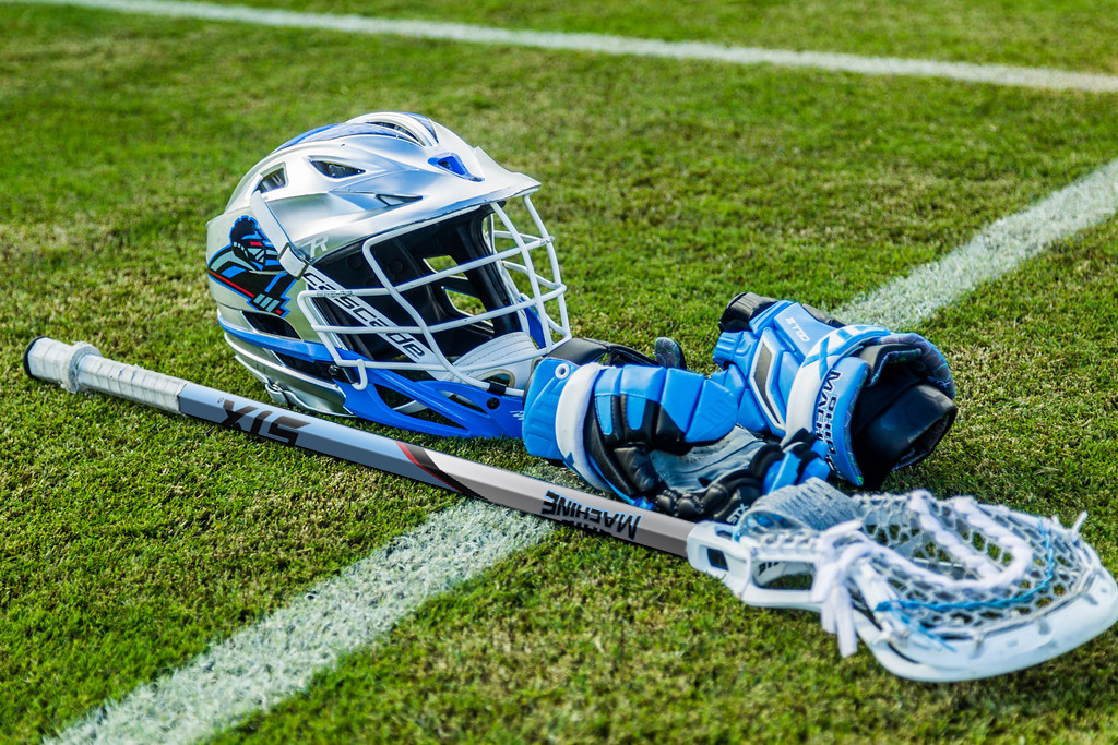
STX partners with the Major League Lacrosse and one of it's teams, The Ohio Machine, asked STX to develop marketing materials for a youth camp the team hosted in 2017.
I was asked to design a lacrosse stick graphic for the team and camp.
After connecting with our marketing manager at STX, I acquired brand elements from the Ohio Machine and began researching how the team incorporates their visual brand elements both in marketing and in-play.
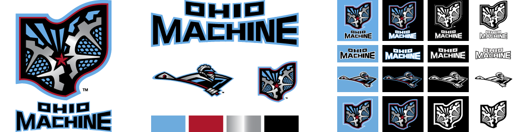
Ohio Machine brand elements.
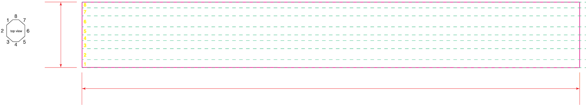
Wireframe for brand elements. Dark gray zones represent common locations athletes place lacrosse tape for additional stick grip.


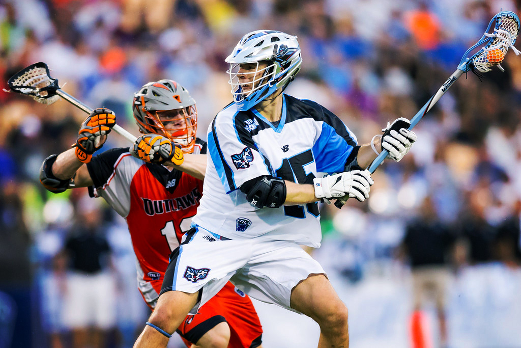
Final lacrosse stick graphic mocked up with Ohio Machine's Peter Baum.
When studio shots are taken for marketing campaigns and limited product resources are available, photo manipulation is necessary to show either a campaign correction or how the product as it will appear in the public. I was responsible for making these changes.
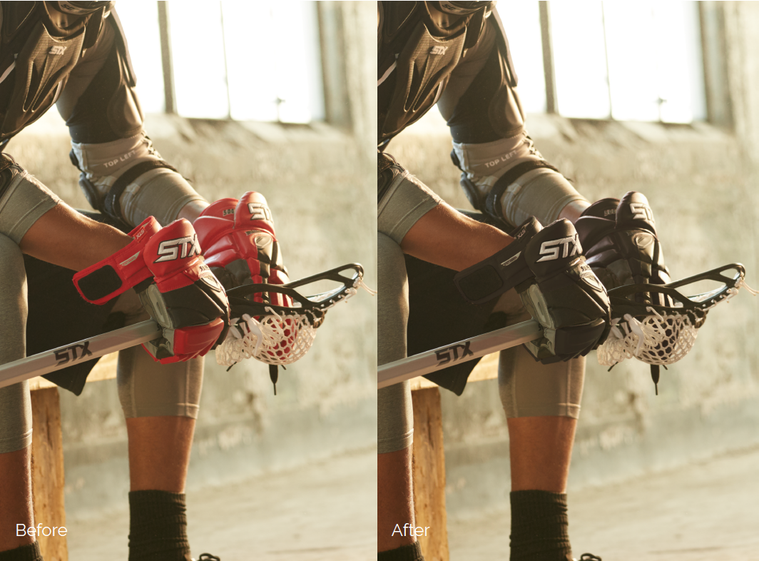
Color correction of studio photos to show product in alternative colorways. Retaining the atmospheric light and color to make the color shift seem realistic was top of mind when going from a colored sample to a black adjustment.
I designed a commemorative lacrosse stick for the 2017 Division 1 Men's Lacrosse Tournament to be played at Gillette Stadium in Boston, MA. Pulling inspiration from historic Boston moments such as the Boston Massacre of 1770, the Boston Tea Party of 1773, and the Siege of Boston, I designed this stick to speak to the city's patriotism, resiliency, and significance in the shaping of American history.
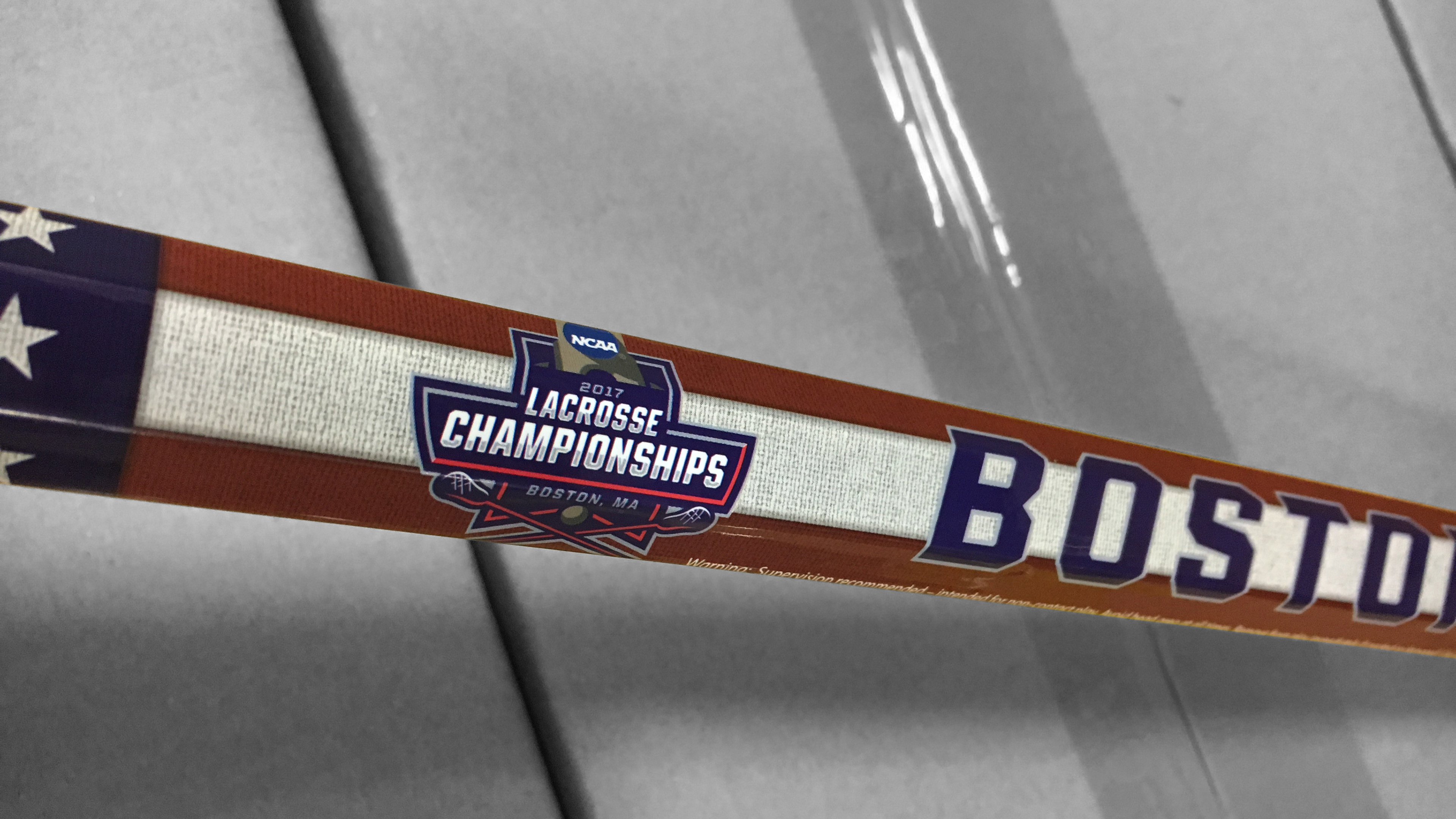
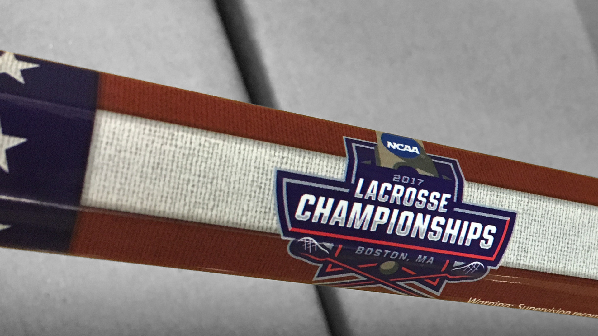
Detail showcasing historic linen textures.
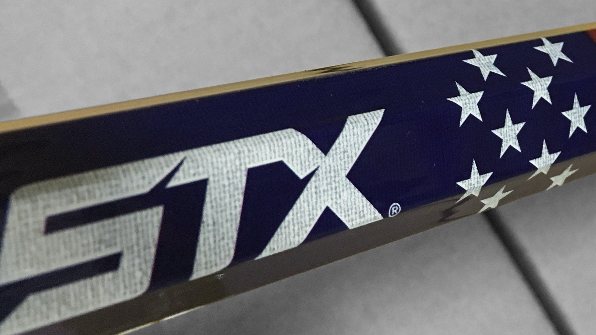
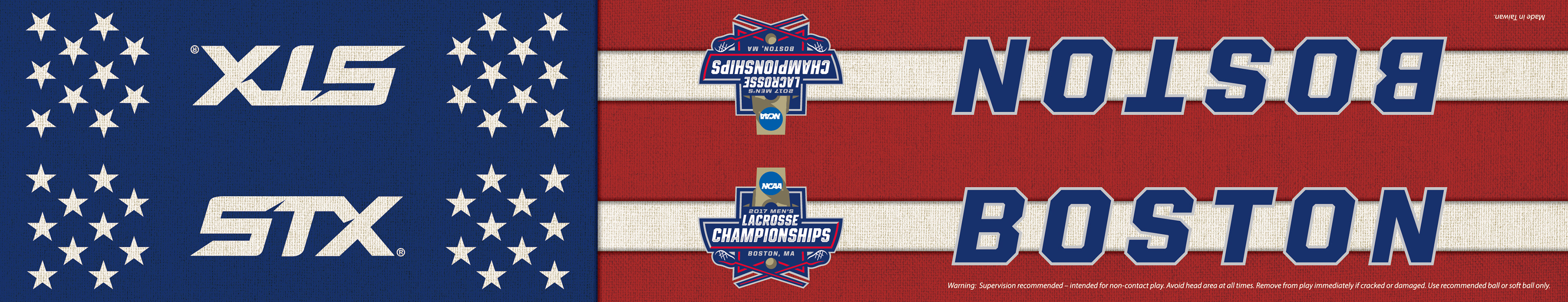
Stick graphic designed for the 2017 NCAA Division 1 Men's Lacrosse Tournament in Boston, MA.
Additionally, I designed commemorative lacrosse sticks for the 2017 Division 2 and 3 Women's Lacrosse Tournament. These two tournaments typically shared the same visual elements, so after pulling the colors from the NCAA and tournament logos, I created a motion-inspired aesthetic for both.
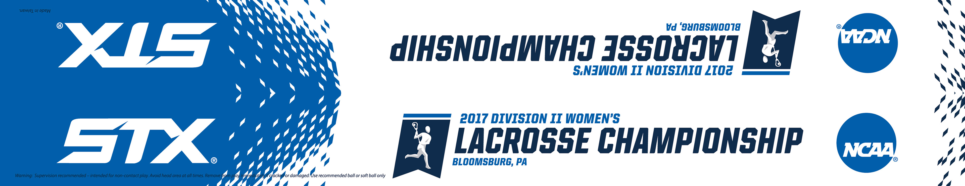
Stick graphic designed for the 2017 NCAA Division 2 Women's Lacrosse Tournament in Bloomsburg, PA.
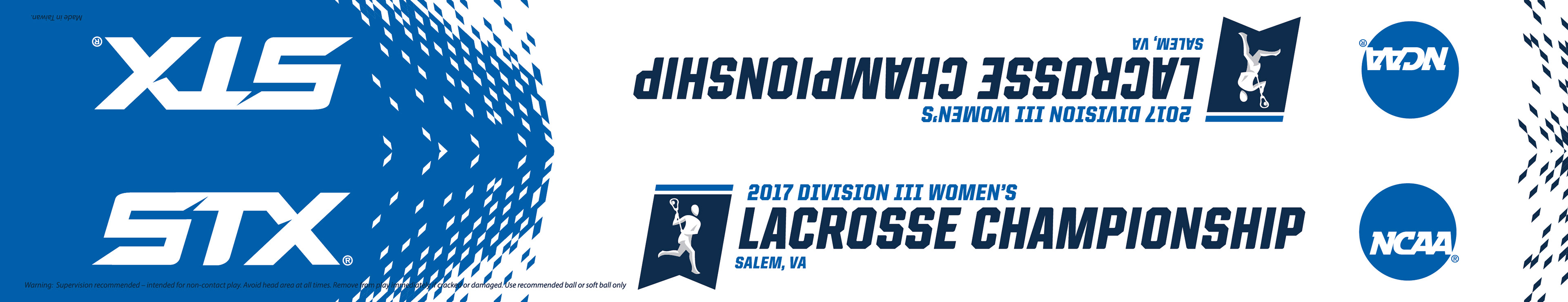
Stick graphic designed for the 2017 NCAA Division 3 Women's Lacrosse Tournament in Salem, VA.
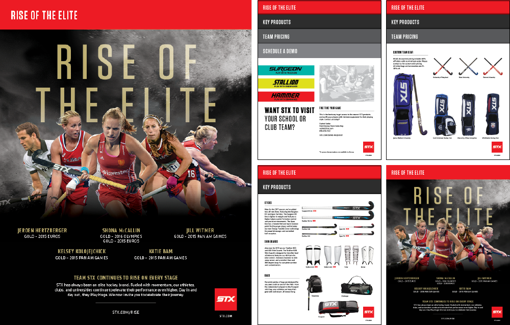
Marketing piece designed to promote STX Field Hockey to coaches and partners.
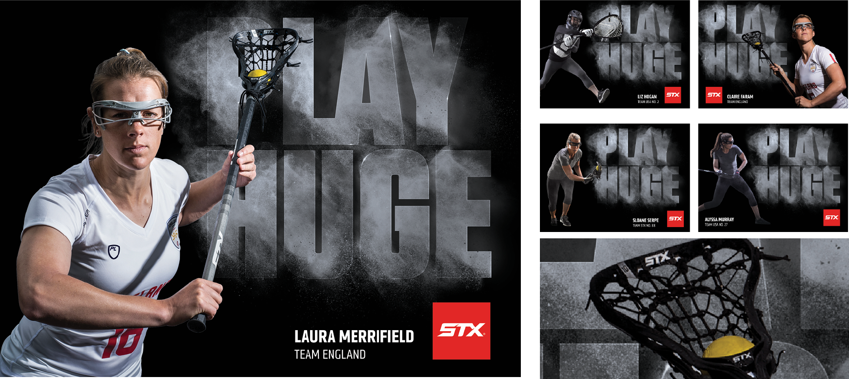
Team STX Women's Lacrosse autograph cards designed after leveraging an outside agency's design spec. Photo manipulation, cut outs, and production design.