Overview
Creative direction for Pole Base, a subsidiary of Redi-Rock International. I was responsible for the development and implementation of the brand along with website wireframing and visualization, print marketing materials, technical guidebooks, CMS management, and promotional items associated with the brand.
Creative direction for Pole Base, a subsidiary of Redi-Rock International. I was responsible for the development and implementation of the brand along with website wireframing and visualization, print marketing materials, technical guidebooks, CMS management, and promotional items associated with the brand.
Challenge
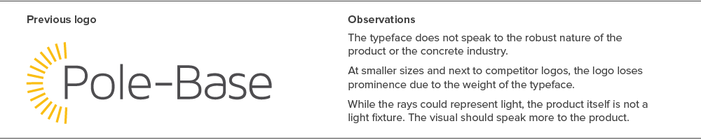
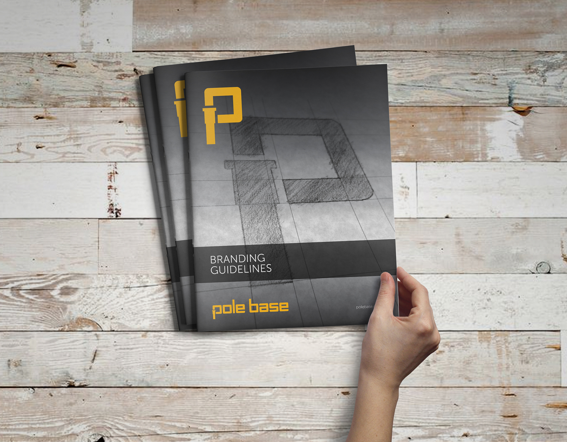
The Pole Base product received a placeholder brand and identity from the previous designer. The brand wasn't thoroughly developed and as the product began to gain momentum in the market, a closer look needed to be made to establish an evergreen solution for the brand's visual and written identity.
The Pole Base product received a placeholder brand and identity from the previous designer. The brand wasn't thoroughly developed and as the product began to gain momentum in the market, a closer look needed to be made to establish an evergreen solution for the brand's visual and written identity.
Task
I met with one of the owners, general manager, and marketing manager of the company and discussed the future of the Pole Base brand. I saw it as an opportunity to address concerns with the current placeholder logo and establish an evergreen identity system that could create an impact in market.
I met with one of the owners, general manager, and marketing manager of the company and discussed the future of the Pole Base brand. I saw it as an opportunity to address concerns with the current placeholder logo and establish an evergreen identity system that could create an impact in market.
Actions
A competitive analysis was conducted of similar companies in the market and neighboring construction-related industry. Mood boards were developed to visualize similar brands based around visual strength of the identity and position in the marketplace. This research was pivotal in shaping the direction where the brand needed to go both aesthetically and in copywriting.
A competitive analysis was conducted of similar companies in the market and neighboring construction-related industry. Mood boards were developed to visualize similar brands based around visual strength of the identity and position in the marketplace. This research was pivotal in shaping the direction where the brand needed to go both aesthetically and in copywriting.
I then investigated our existing outreach with existing logo both in the digital space and in the print space. This step was important to see how many people a possible brand change would have affected both regarding brand recognition with current consumers, but also from a resource/cost standpoint. Fortunately, because the company was still in the development phase and marketing materials were produced at an ad hoc basis, a visual change would be expected and received positively once going public.
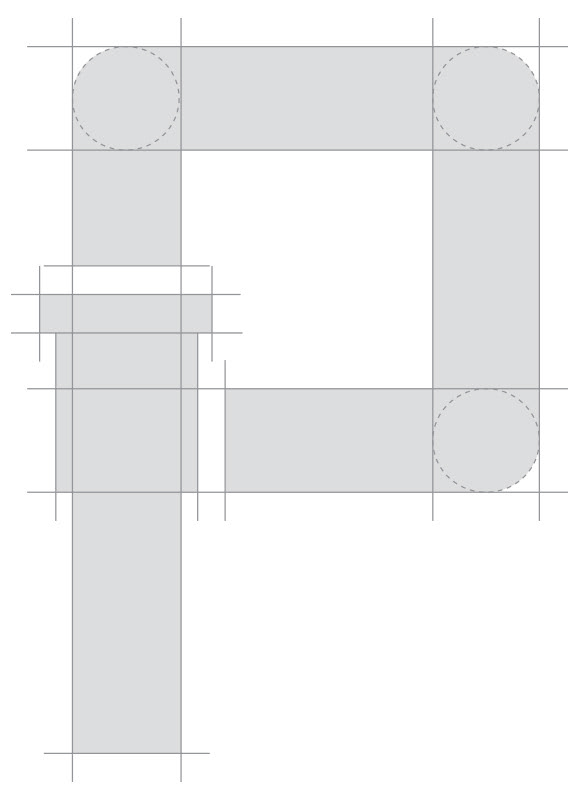
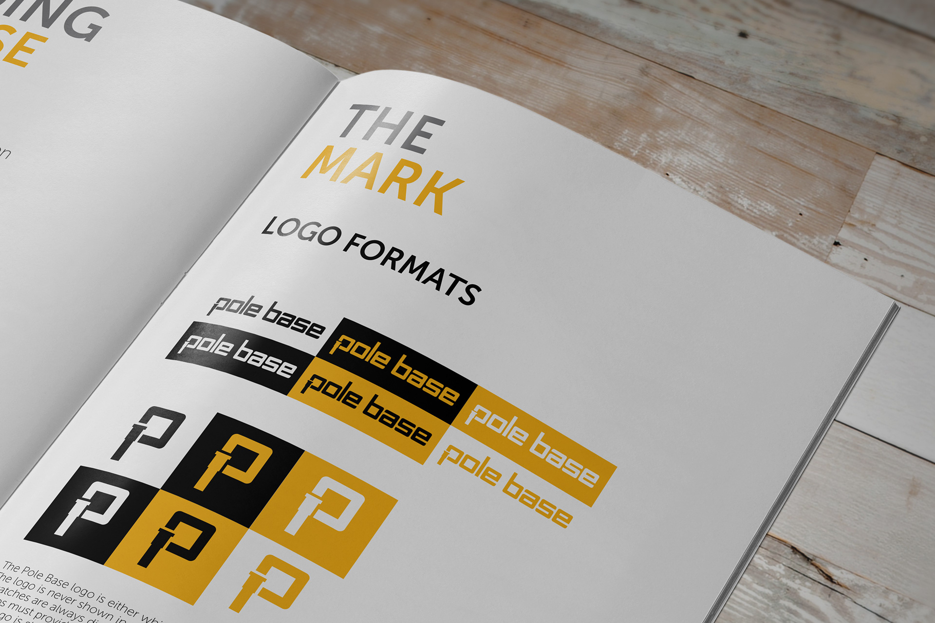
The symbol and wordmark were both designed with a silhouette of one of the product forms and further emphasised through the custom display font I developed. Using the baseline of the custom display font I developed, I emulated how a Pole Base® is installed within the logo. Using the descender of the symbol and wordmark as a nod to the below-the-surface installation of the product, and the remainder of the letterform to speak to the visual aesthetic of the product; how a Pole Base sets itself apart from the competition.
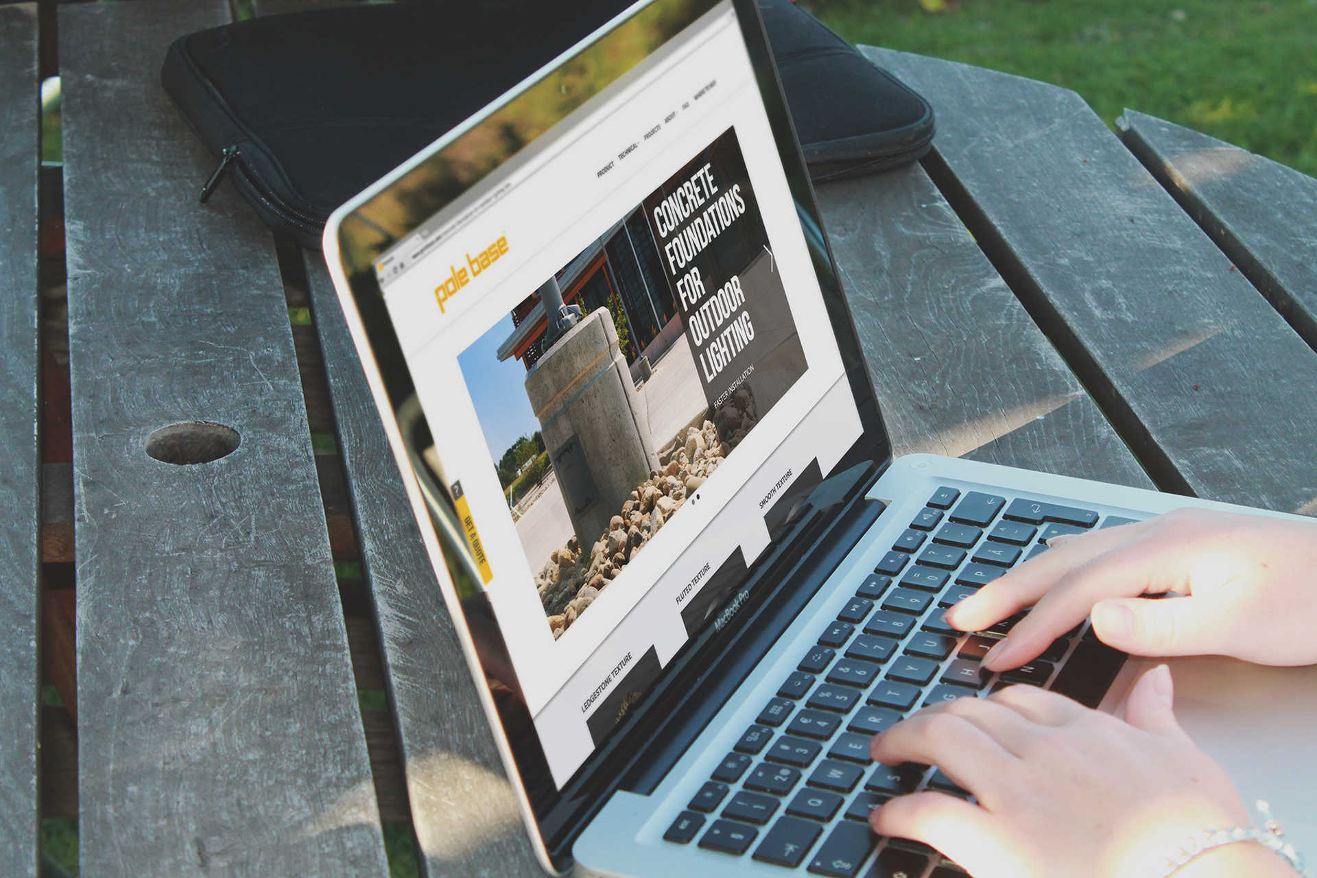
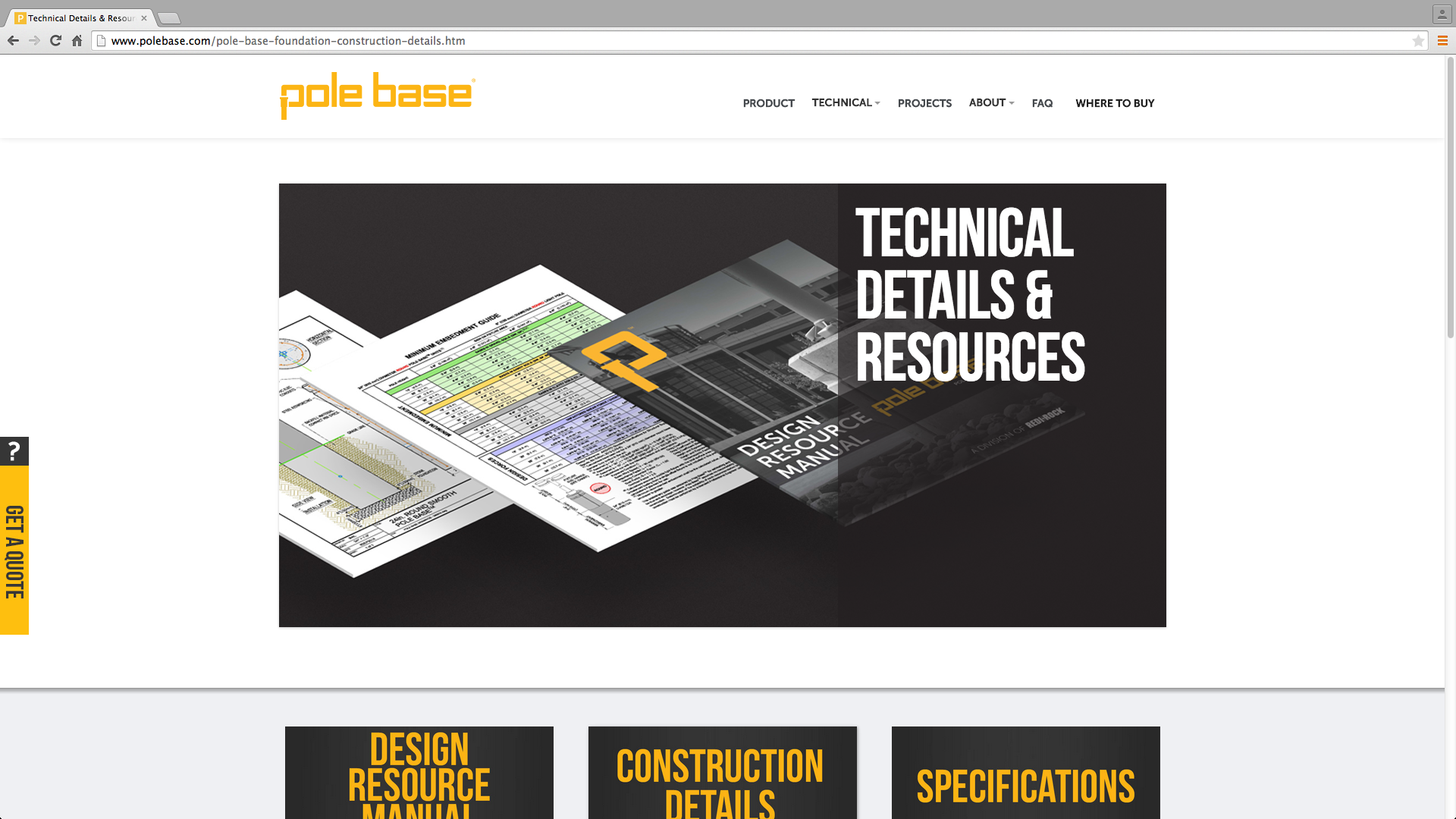
Once a robust brand guideline was created, I began working with a developer to design the Pole Base Website. User profiles were created to identify potential and targeted audiences that would interact with the website. After a map of the proposed infrastructure was established, wireframes were developed which later influenced later visual design which would be migrated using a CMS.
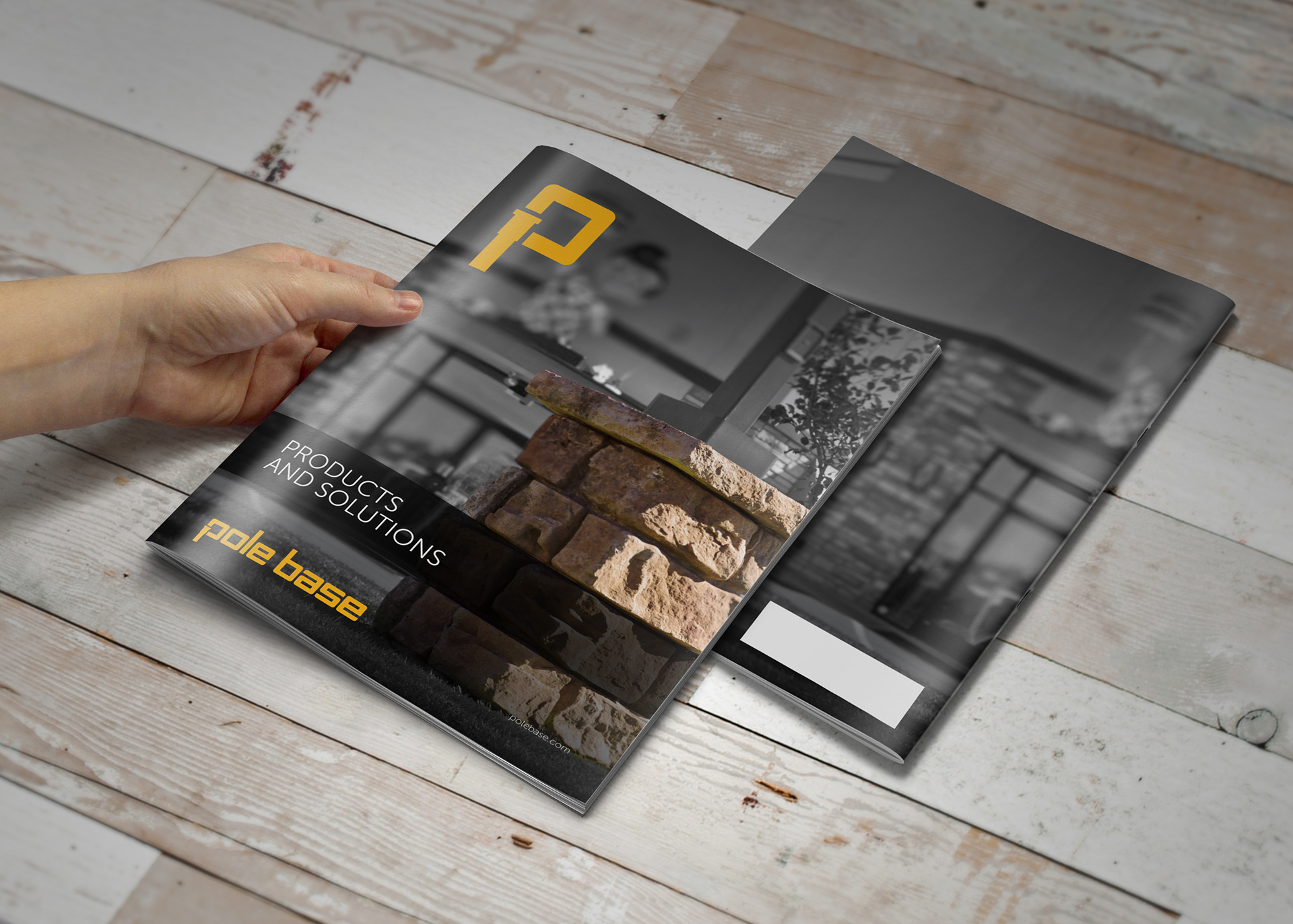
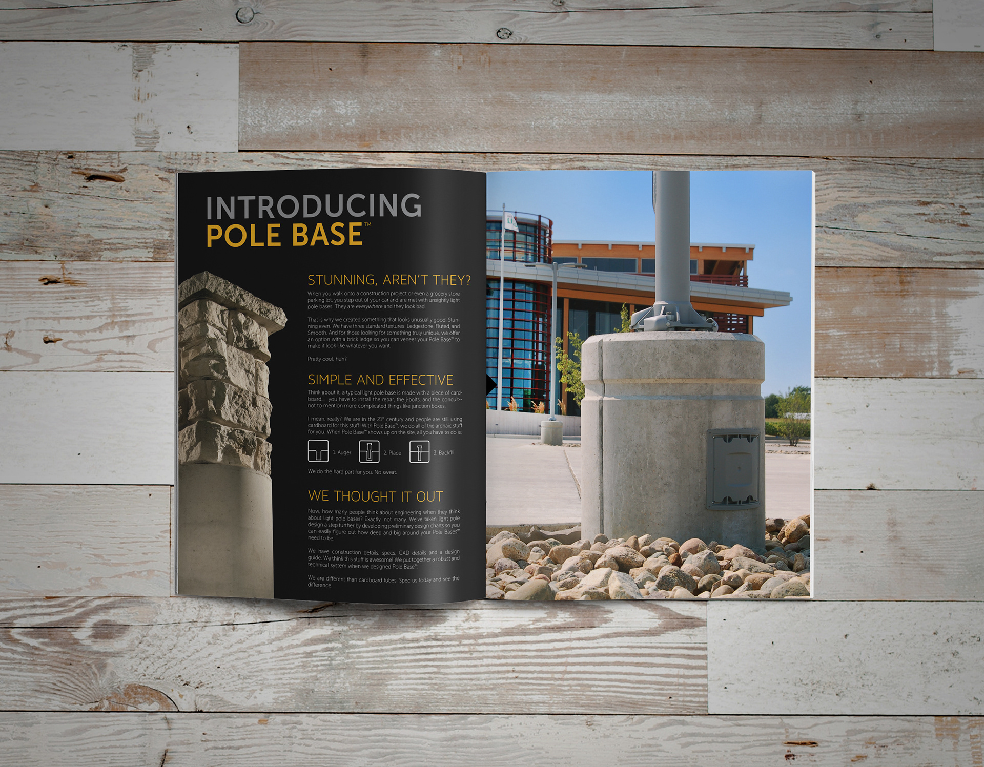
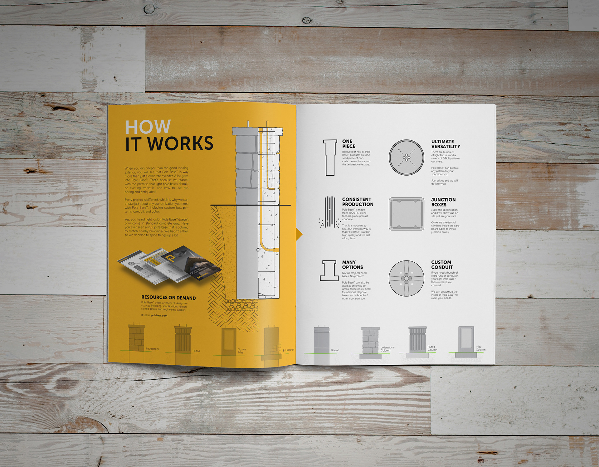
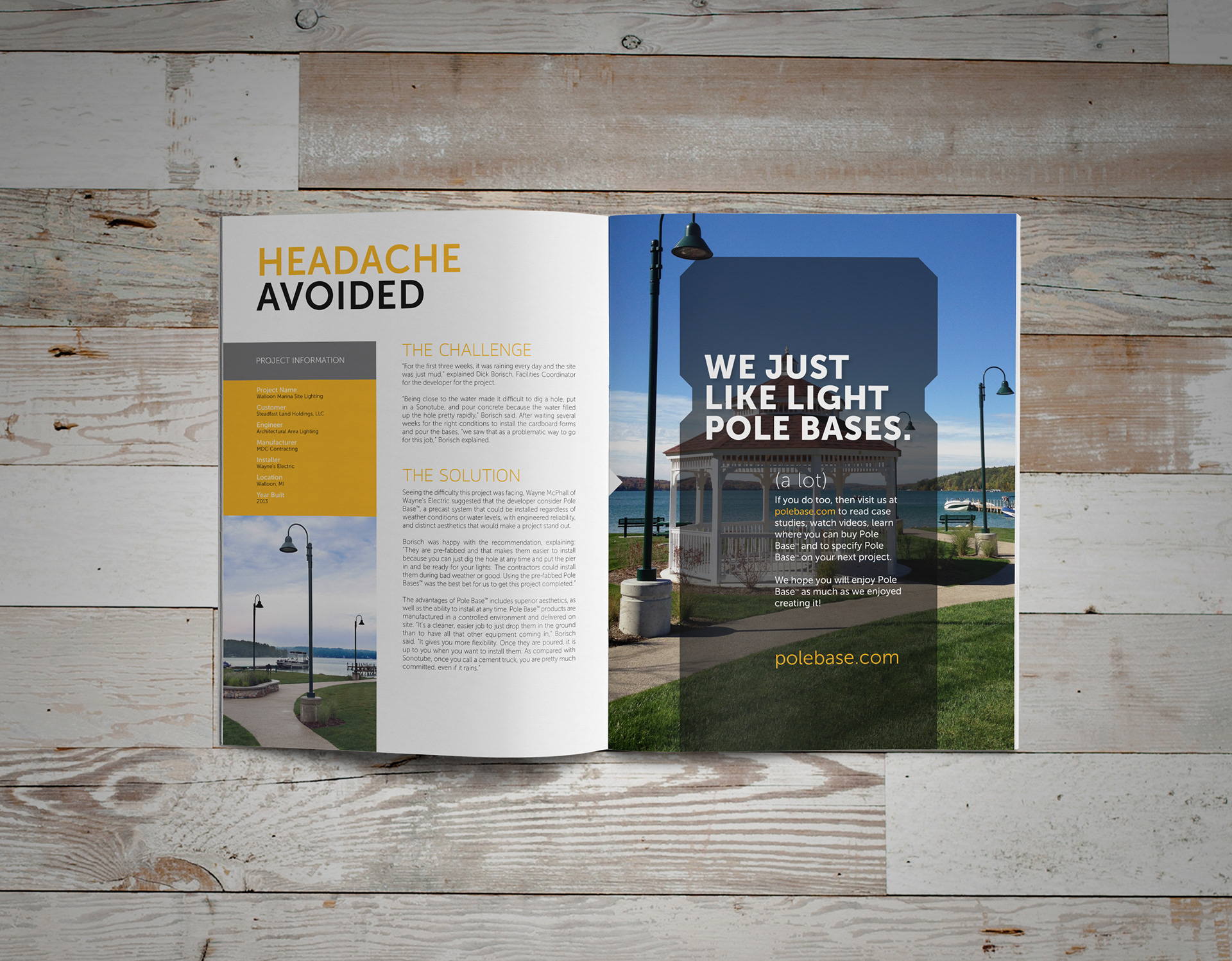
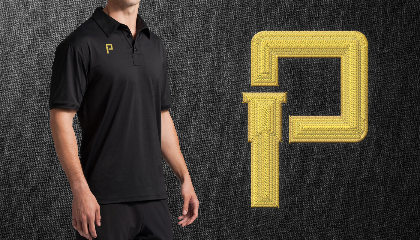
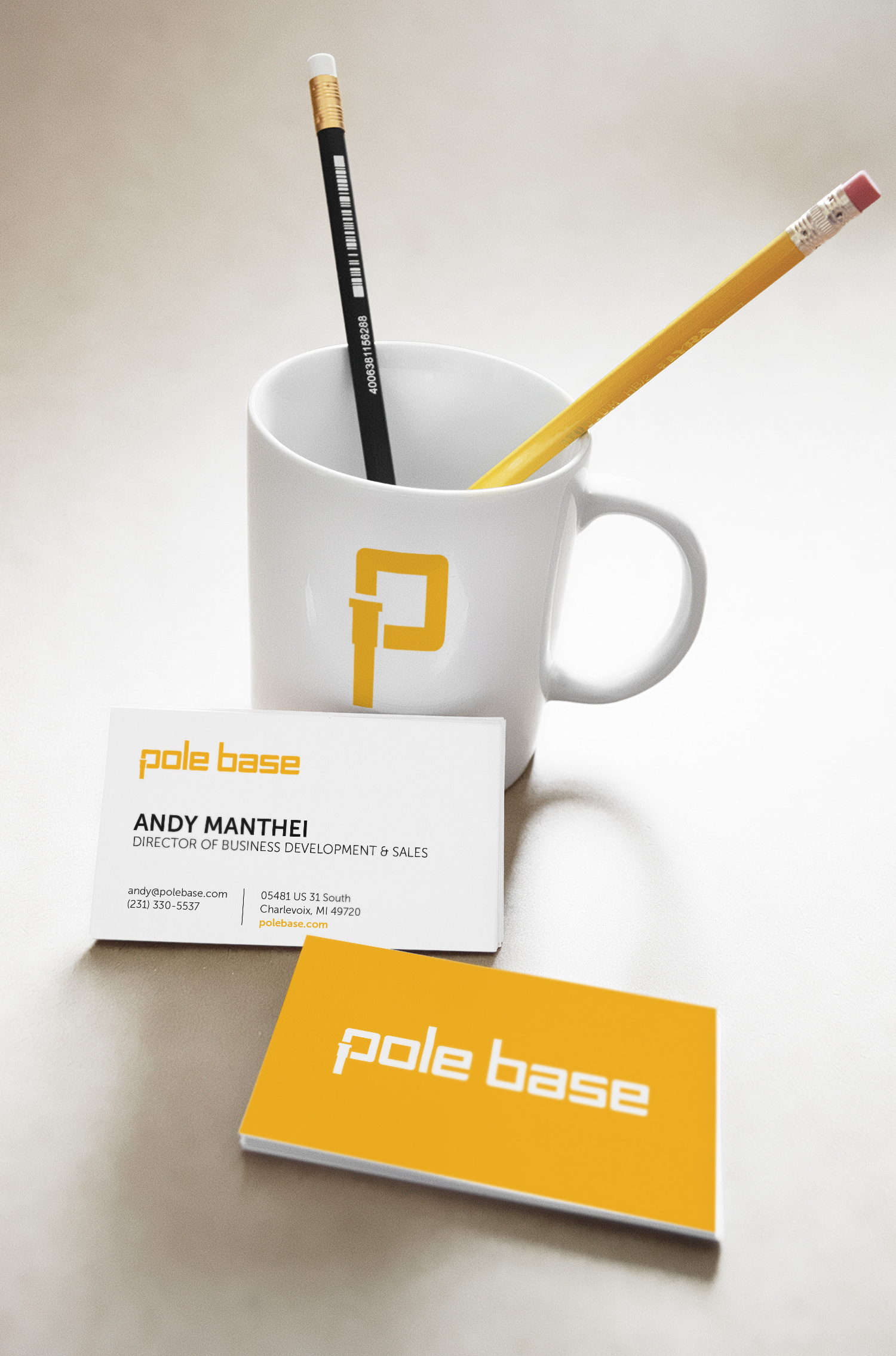
Print materials were later developed for marketing and business needs.

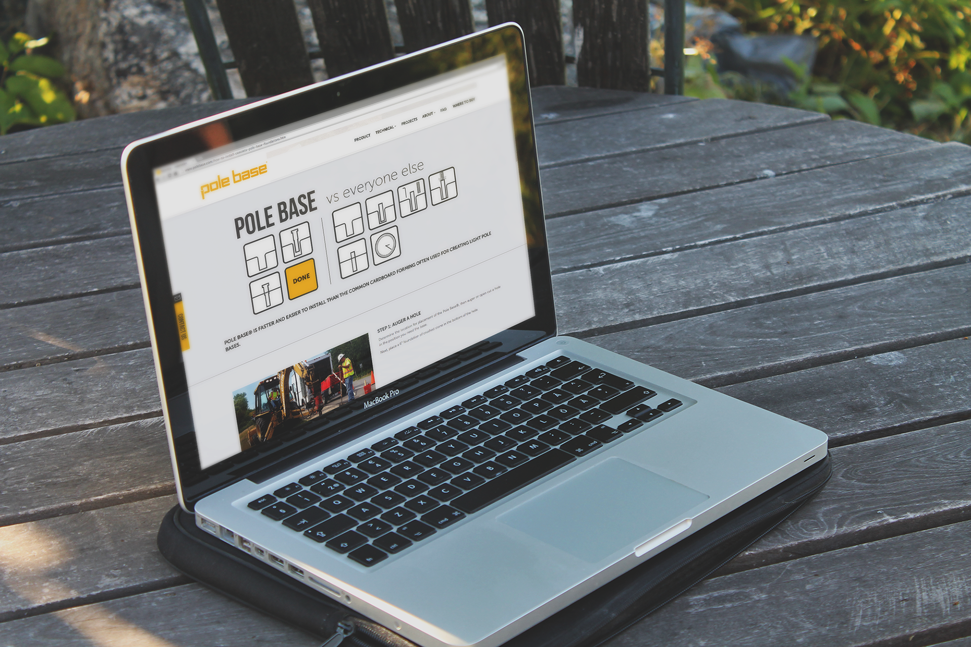
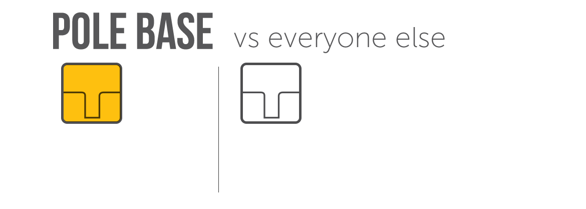
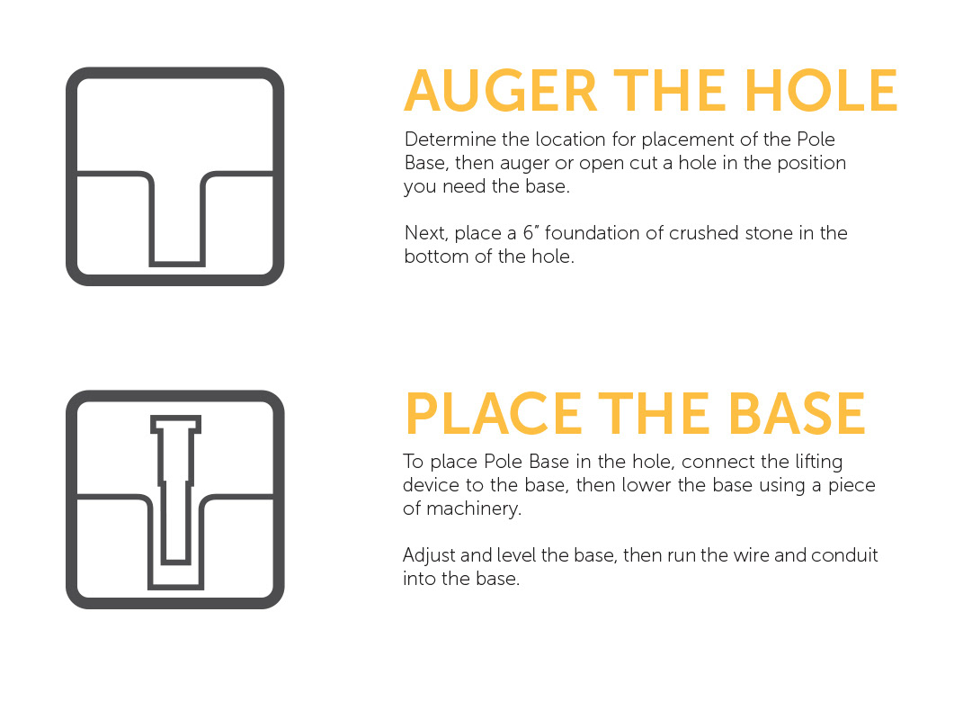
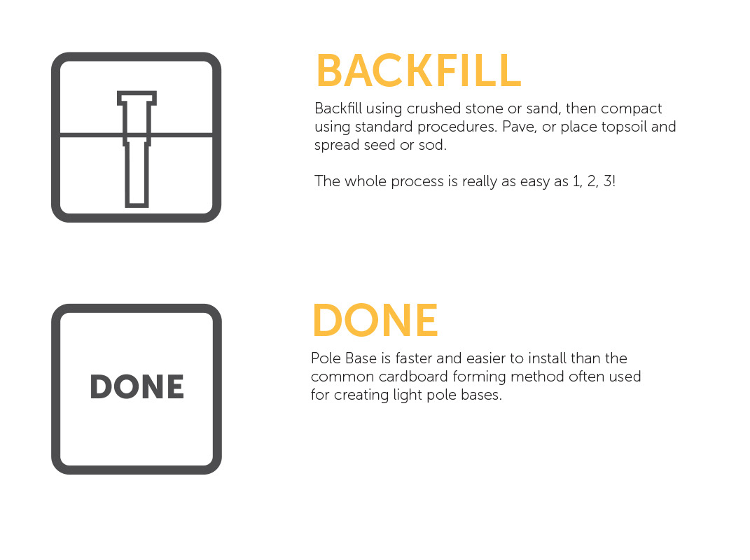
Animation developed to visualize the ease of Pole Base installation vs competitors.
Logotype is displayed as lowercase to emulate the product installation
In addition to the brand's visual identity, a brand voice was established to add personality and consistency with how the product is marketed in print, web, and social media.