
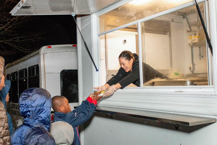
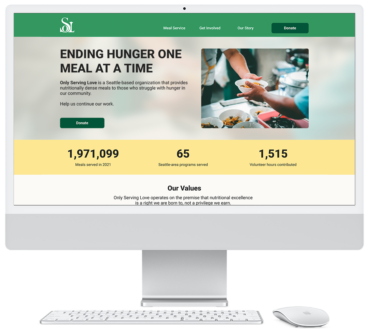
Ending hunger, one meal at a time
Only Serving Love (OSL) is a non-profit based that serves nutritionally dense meals for Seattle's food insecure population. OSL approached the School of Visual Concepts to redesign their website to achieve a better experience for users. They hoped to tell OSL's story better, while making sure the content is presented in a clear, compelling manner.
OSL was also in the middle of a rebrand where the existing design language system would eventually be replaced by the work that was created by an outside agency.
Our team was asked to focus was on refining information architecture, interaction design, and wireframes that could be leveraged once the visual design was completed down the road.
Timeline: June 2022–September 2022 (10 weeks)
Tools Used: Figma, Google Forms, OptimalSort, SquareSpace
My Role:
UX Research, Client Liaison
UX Research, Client Liaison
Team:
4 UX Designers
4 UX Designers
While each designer on our team had assigned primary roles, we each collaborated on respective parts of this project as we encountered them during the design process.
The challenge
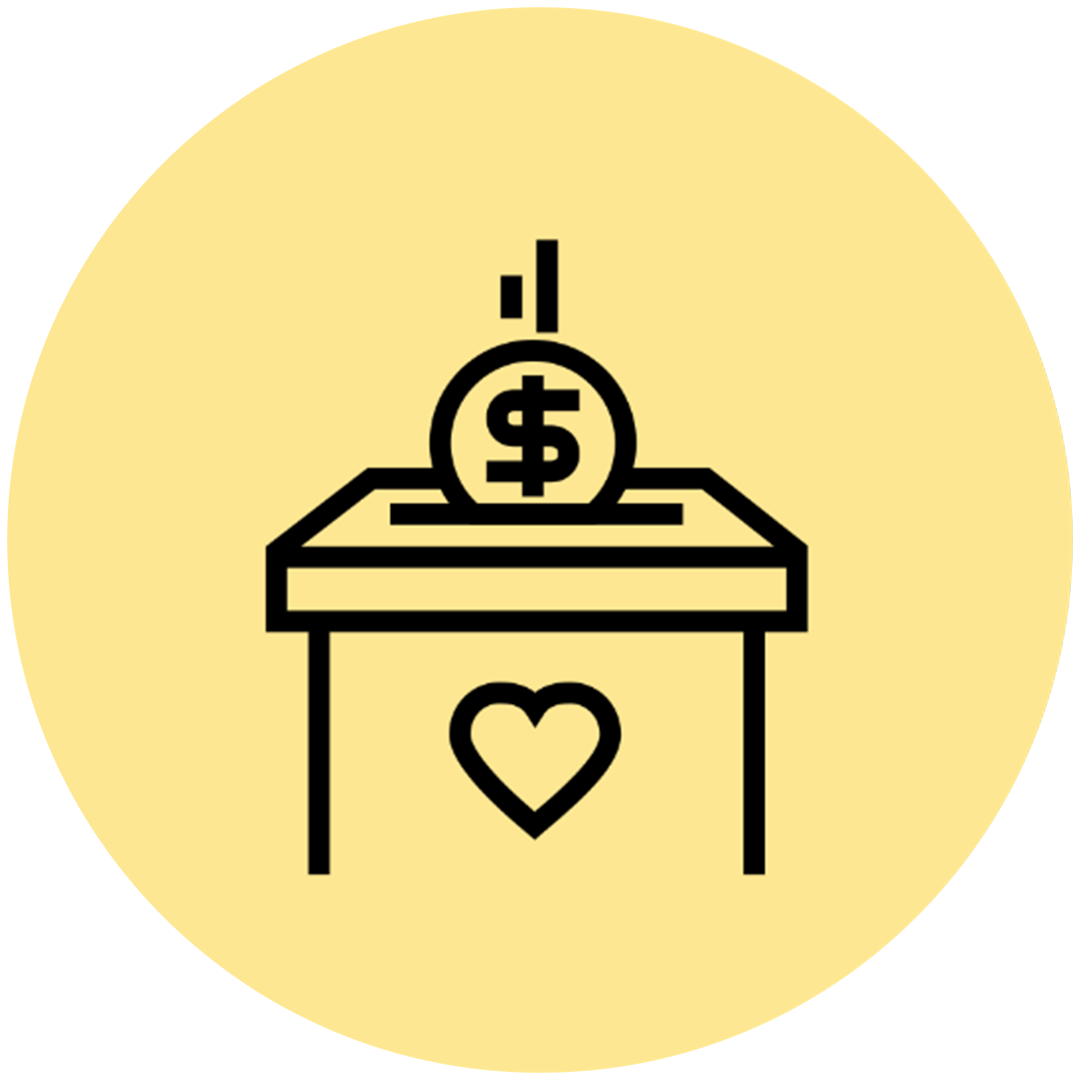
Not enough donations

The story was being lost
Who are we designing for?
1. Public and corporate donors
2. Volunteers
3. People looking for meal service
2. Volunteers
3. People looking for meal service
Constraints
10-week timeline: During this time period we conducted and gathered research, made major information architecture decisions, designed wireframes and IxD, tested, refined, and presented to our client.
Squarespace: We knew the OSL site would be hosted on Squarespace, so we had to ensure our designs would integrate with that platform.
Limited existing data: Early on our team discovered that OSL didn't have all the answers to the questions we had – and we had to be ok with that. So things like page analytics, donation data, demographics, and partner references were unavailable to us during the project.
Research
What drives people to donate?
Mission: People consider causes that resonate with them, whether it’s through a personal connection or they are moved to action by a compelling story. Of our 30 survey participants, 80% consider organizations whose cause is personal to them.
Trust: People need to be able to trust the organization. It helps if the organization has a good reputation, or if other people they trust support the cause. Our survey results showed that 60% of our participants will consider organizations after being recommended by people they trust.
Impact: People want to make a difference, and they want to feel like they’re a part of something good. We’ve found that the number one reason why donors stop giving, is because they don’t know how their gift is being used and what impact their contribution makes.
Heuristic evaluation
In addition to a survey, we conducted a heuristic evaluation.
I recommended this research method after assessing the amount of time our team had to conduct research. With only three weeks available to us to conduct research, it would have been challenging to fit other primary sources of research into our schedules given the time constraint.
We used a set of conversion-based guidelines in our heuristic evaluation: Relevance, Trust, Orientation, Stimulation, Security, Convenience, and Confirmation
We rated each guideline on a scale of 0=no problem to 4=critical
The OSL website averaged a score of 2.7
Two areas that needed the most improvement were stimulation and convenience, both scoring a 3.0 (major problem)
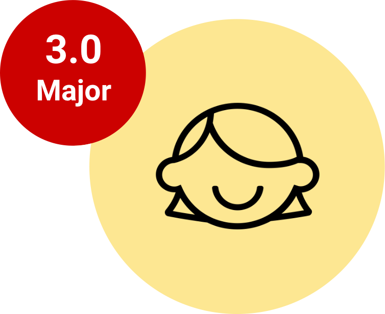
Stimulation: Value, relevance, and reward
Does the site offer clear and relevant value propositions? Does the site create a fun user experience, and are they unique to competitors?
Convenience: Functionality, clarity, ease of use
Are the forms convenient? Is the design light and easy, and is it functional on all devices? Is it explained clearly or help provided?
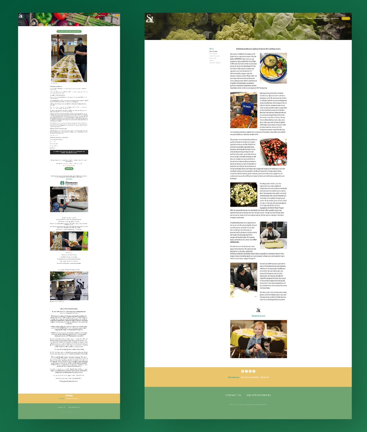
Homepage & Our Story: These pages are areas where the storytelling is crucial, but these pages fell short.
The most stimulating elements of these pages are the photographs, but they are rendered less effective by the volume of text.
There's too much said (stimulation issue).
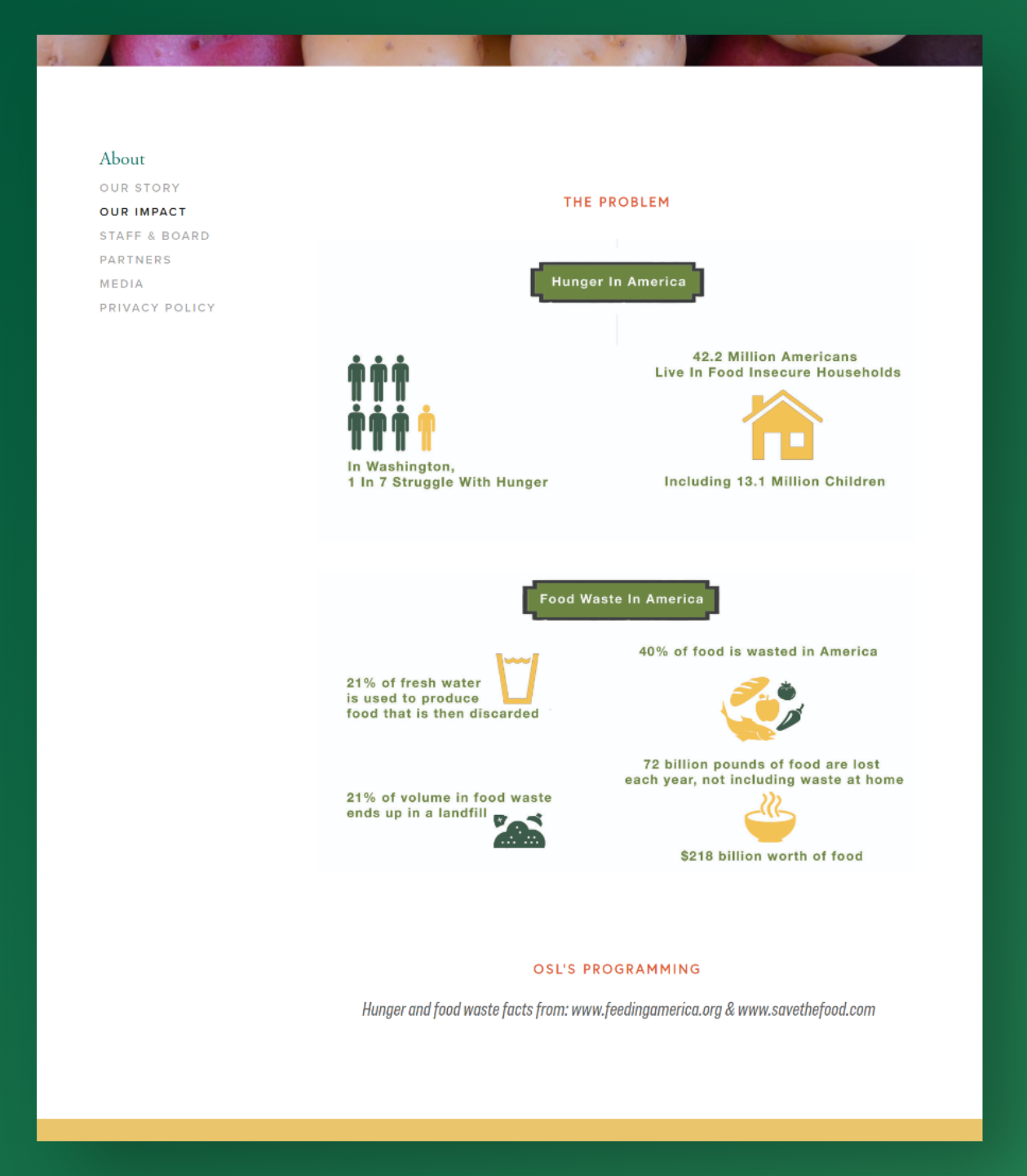
Impact: This page had the opposite problem; the presentation looks more promising, but the the page looks incomplete.
It shows the problem, but not the solution.
There is not enough said (stimulation issue).
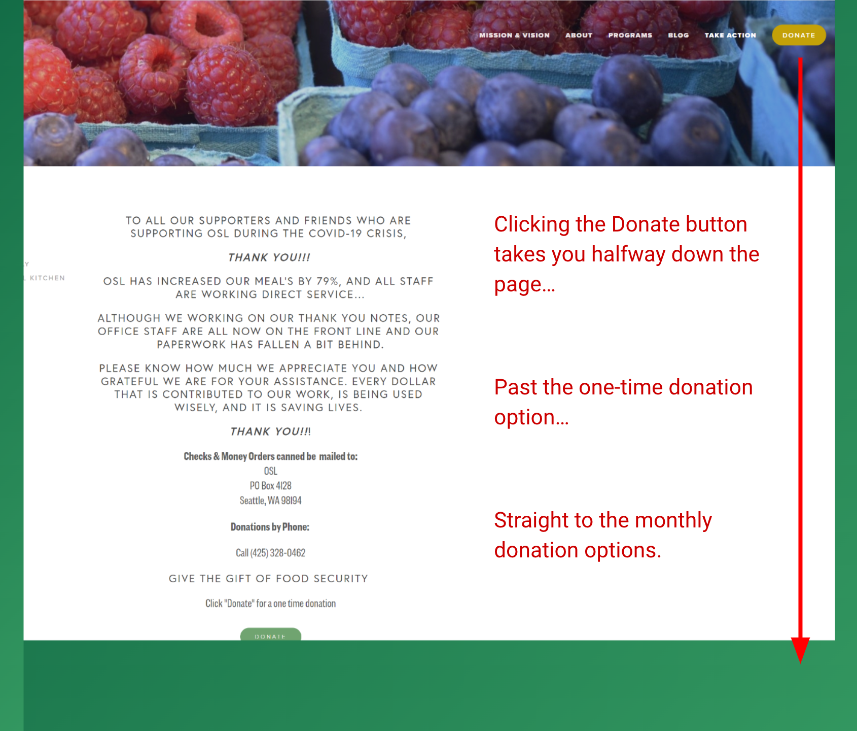
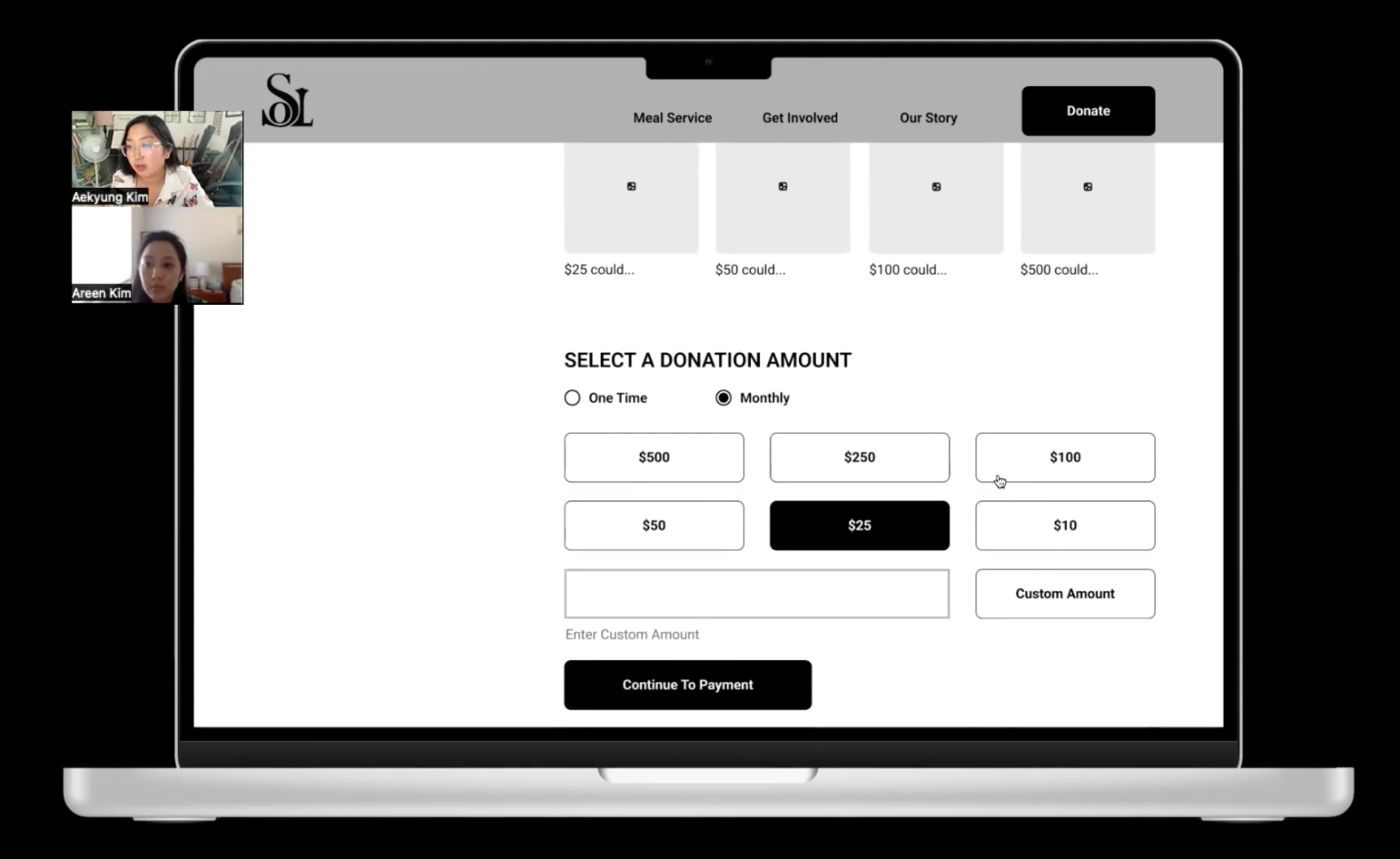
Donate: This page had convenience issues…For example when you load this page, it automatically takes you to the monthly donation section, past the one time donation section
The experience is disorienting.
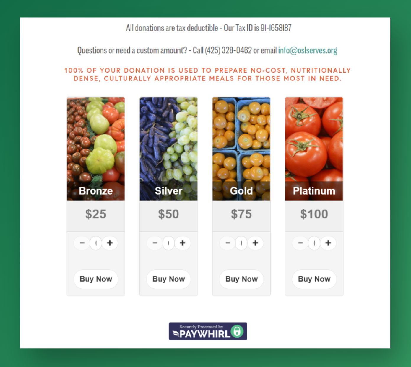
Donate: Further down the donate page we discovered an unconventional UI.
People are used to seeing set plans when they’re paying for a service, but a plan meant for donations is expected to have more flexibility.
Is the email the only way to donation a custom amount? What are the +/- buttons for? The content in the middle of these buttons is obscured and unresponsive.
Competitive analysis
When it comes to successful non-profit website design, we noticed websites have: Clear call-to-actions, short and captivating writing, clear infographics/stats, scannable content, clear understanding of how each non-profit provides impact, use of images to humanize the organization and problem.
Information architecture
Sitemap
We conducted card sort tests to learn how people responded to the site’s current structure and labeling.
The pages that served little purpose or were identified as confusing by participants were either eliminated or absorbed into other categories. (Starbucks, Mobile Meal Kitchen, Serve Safely, Blog, Media).
Next, information-heavy categories (such as Volunteer) were split into multiple pages. We also added a financial reports page to the Impact section, and again in the footer menu.
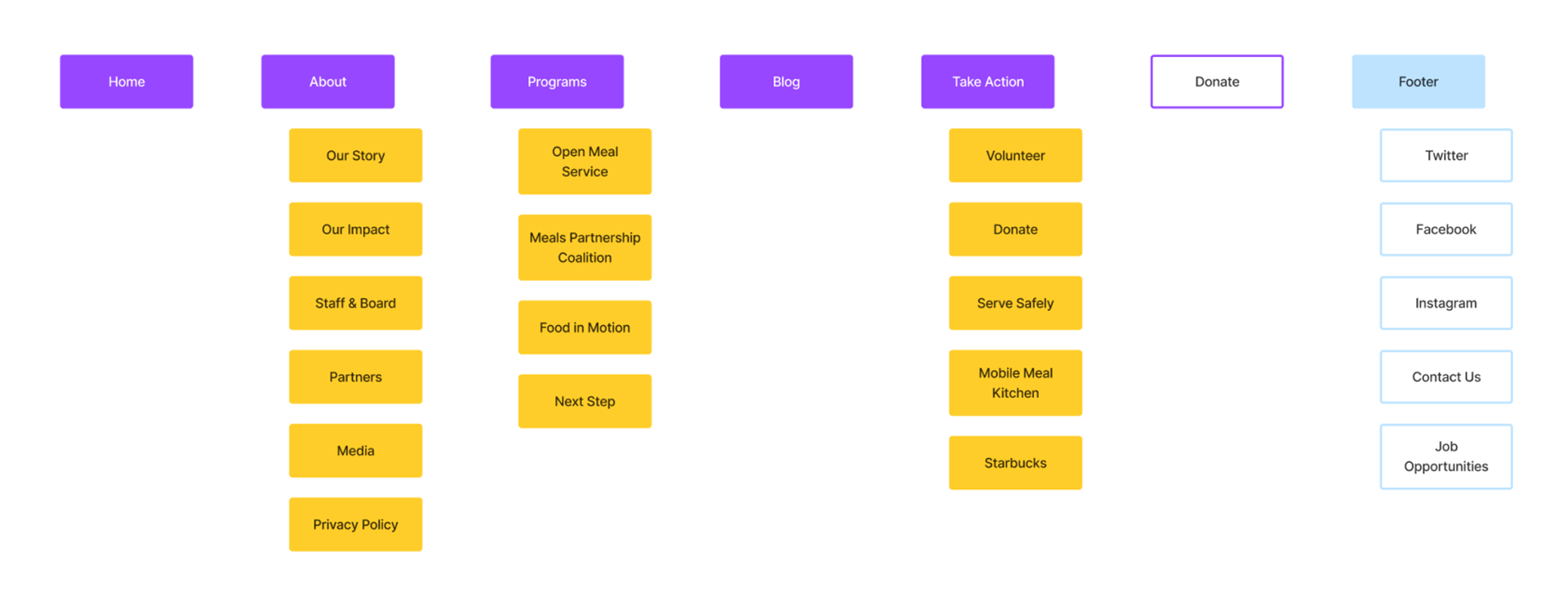
Sitemap (before)
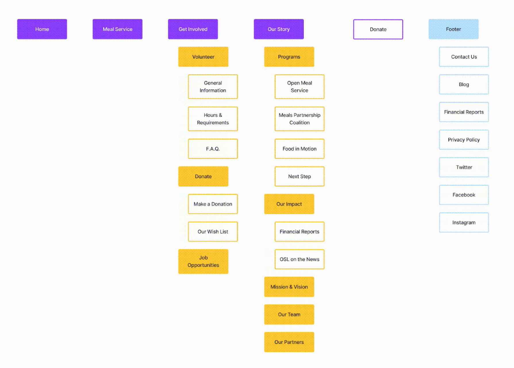
Sitemap (after)
Navigation
We ended up with a simplified structure and a nested menu. We placed “Meal Service” in the main navigation instead of as a subcategory because we think it’s a big part of what OSL is. Now a visitor can get a better idea of the work that OSL does before they even browse.
Navigation (before)
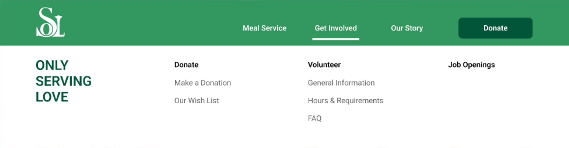
Navigation (after)
Usability Testing + Design
Prototyping & Usability Testing
10 participants
6 tasks
Rating system: 1=easiest to 5=most difficult
Performed with desktop prototype
Test Results
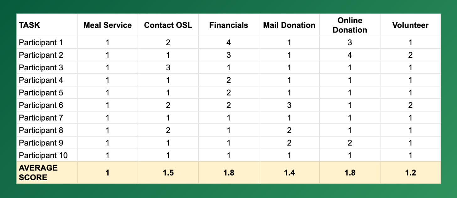
The overall results of the tests were positive. People appreciated the simplicity of the site structure, and had no trouble navigating the website to find the information they needed. They were also able to perform each of the assigned tasks with little to no difficulty.

Notable patterns
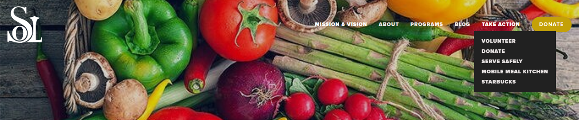
7 people agreed that the logo reads as "SOL" instead of "OSL"
2 people remarked that the name of the organization didn't stick
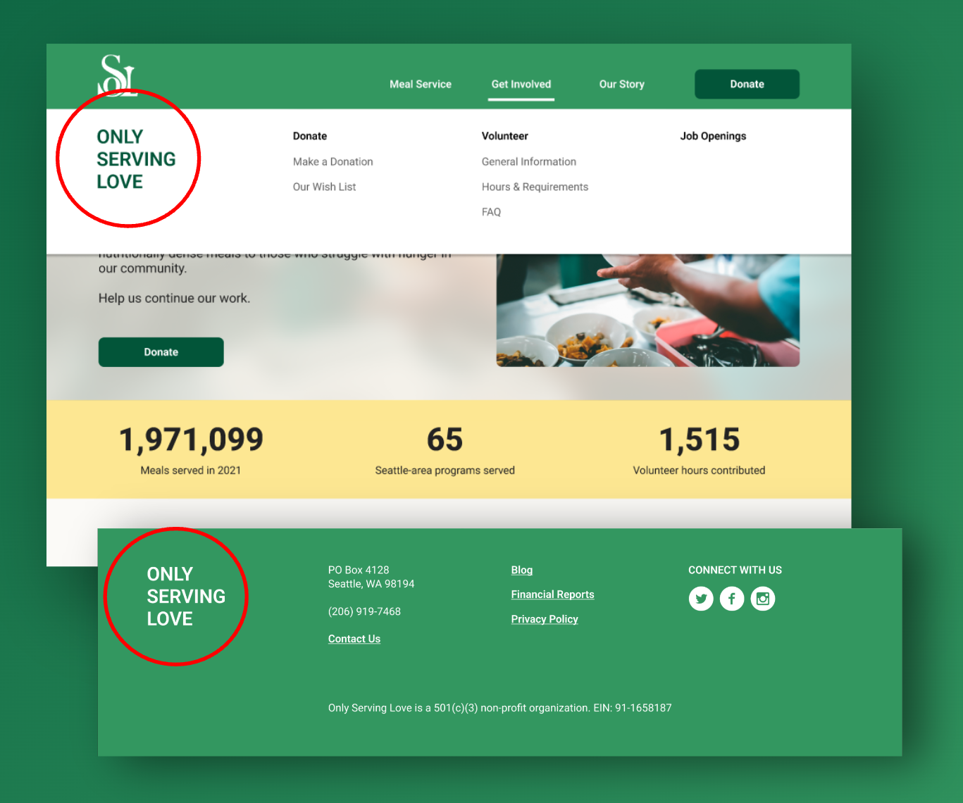
Changing the logo didn’t fall within the scope of the project, but we still agreed that it was important to make the name of the organization obvious and unmistakable. Our next best solution was to display it boldly in the dropdown menu of the main navigation, and also in the footer.
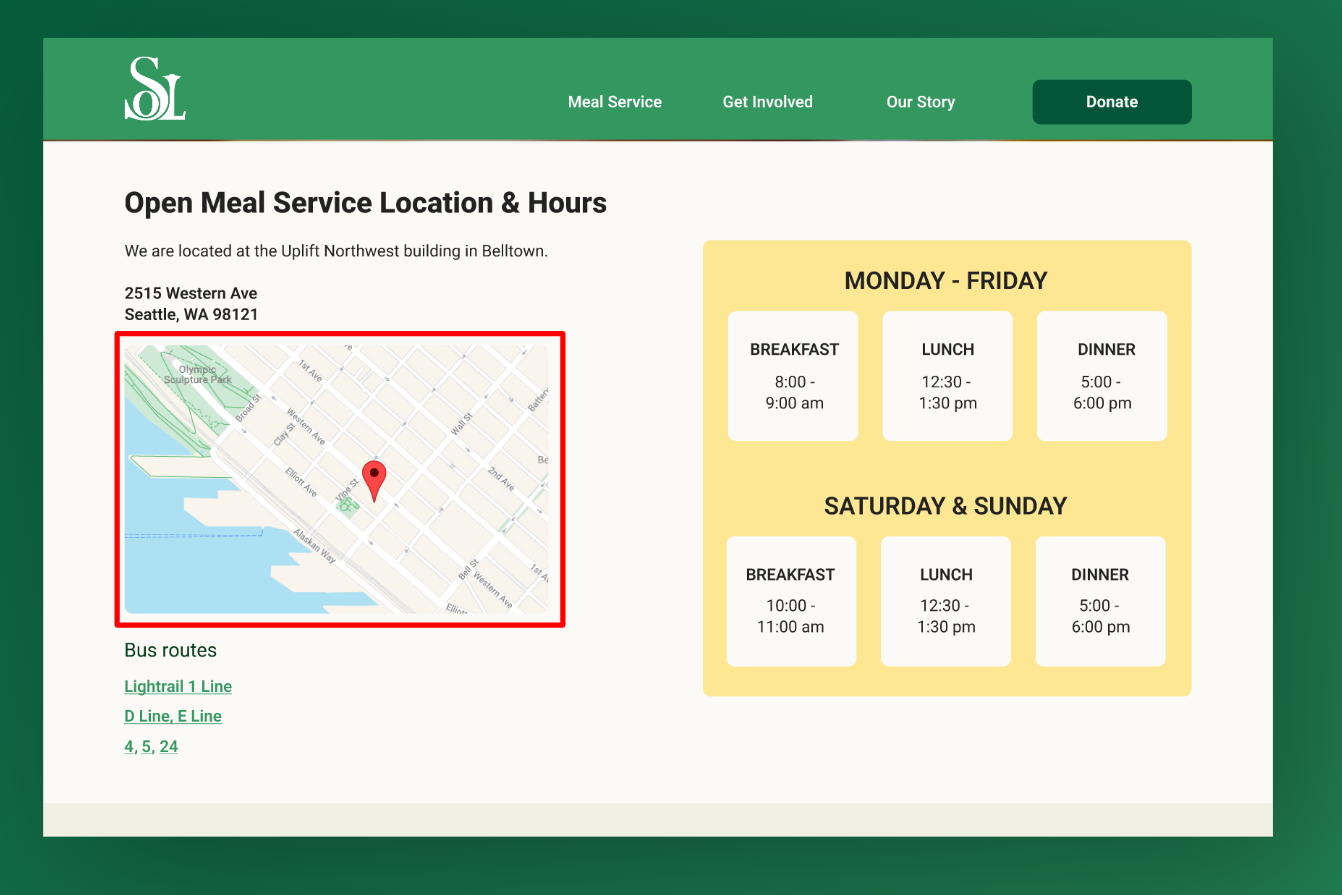
The bus routes under the Open Meal Service page were something we added during the wireframing process, and it was met with a lot of positive feedback.
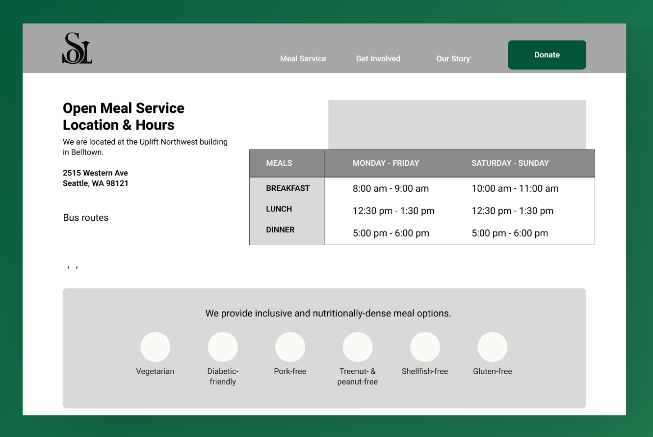
Open Meal Service page (before)
Final Open Mea (before)
4 people in our usability test agreed that having the bus routes listed under Open Meal Service is helpful.
Final Product
We then created high-fidelity desktop wireframes and a functioning prototype for our proposed new design. We were also able to iterate on that design and improve it based on our usability findings.
We did design for the best case scenario, but we understand that there are limitations to Squarespace and OSL’s resources. Most of the design is kept within Squarespace’s scope, but we also provided alternative options in a separate annotated document, just in case certain plugins or coding was not feasible for OSL.
We did design for the best case scenario, but we understand that there are limitations to Squarespace and OSL’s resources. Most of the design is kept within Squarespace’s scope, but we also provided alternative options in a separate annotated document, just in case certain plugins or coding was not feasible for OSL.
Figma Prototype (desktop)
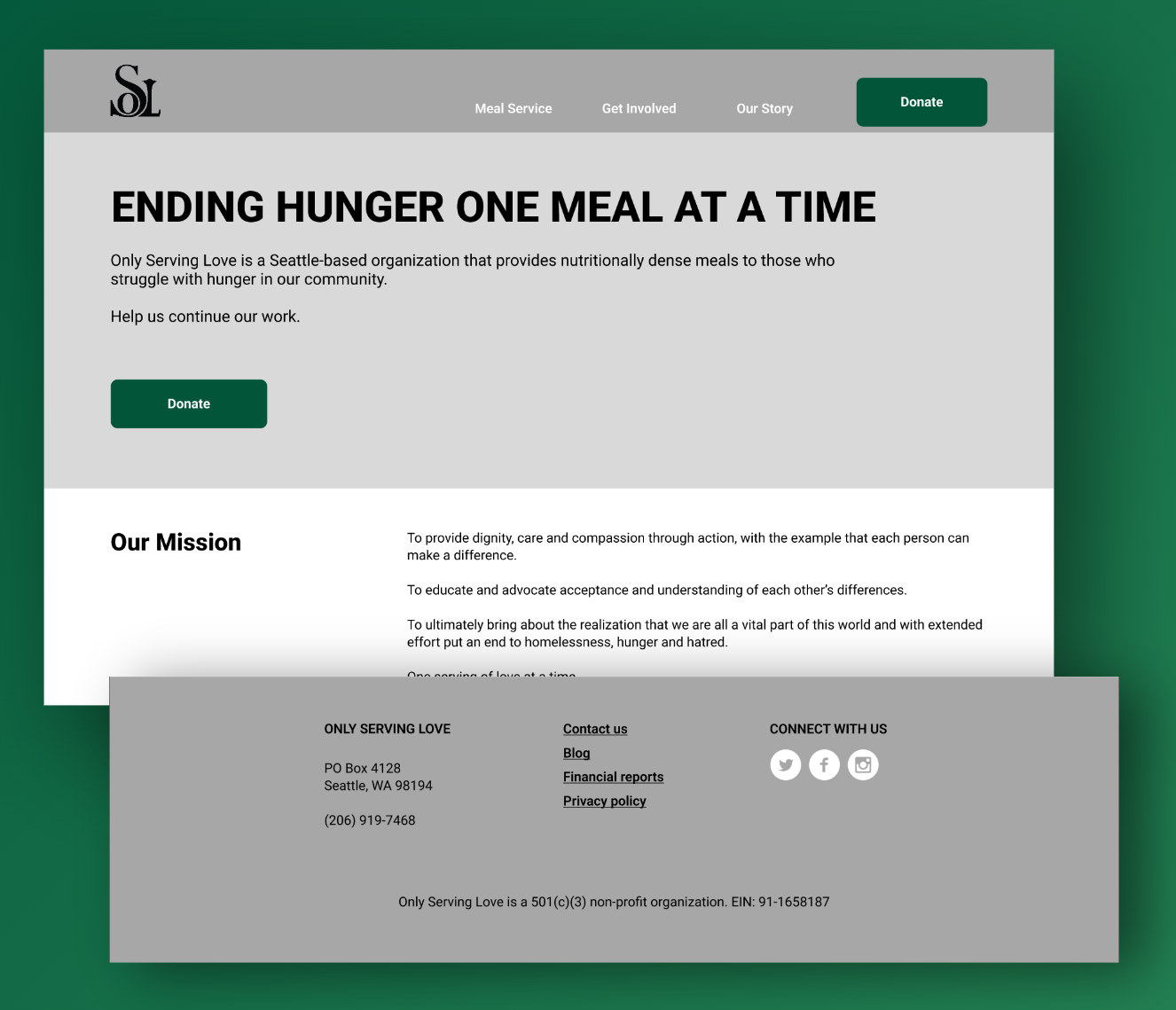
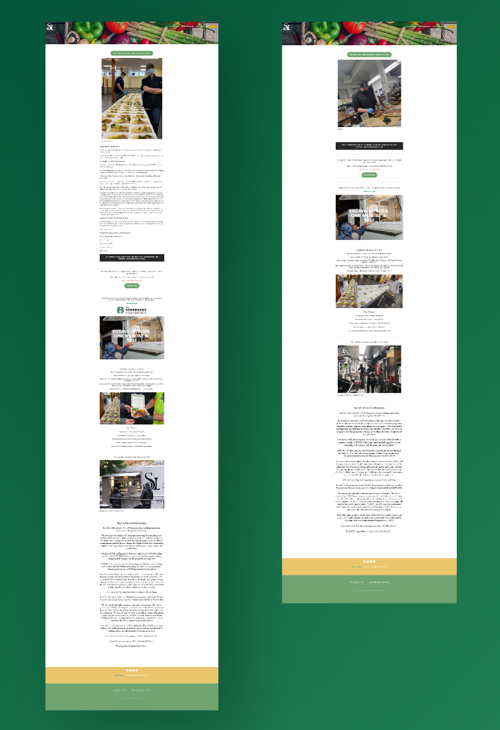
OSL homepage (before)
OSL homepage (after)
Next Steps + Recommendations
In early September 2022 we presented our work to Chris Copacino, our point-of-contact Chris at OSL, which was met with positive reviews. A few weeks later we held a second meeting with Chris and OSL's Executive Director, Beverly Graham, which was met with great enthusiasm to implement the design and recommendations we presented.
In our presentation to OSL, we recommended OSL:
– Gather and upload financial records
– Consider Squarespace add-on features to capture page analytics and user behavior metrics
– Consider changing the logo so it clearly reads "OSL"
– Consider Squarespace add-on features to capture page analytics and user behavior metrics
– Consider changing the logo so it clearly reads "OSL"
We’re pushing ahead with OSL implementation and I want to make sure I have all materials and files from you in-service of reflecting your great work on the site.
—Chris Copacino
What's next?
We delivered: Following our second presentation with Chris and Beverly our team delivered redlines and an annotated document of our design in November 2022.
As of Dec 7, 2022 implementation of our design is still pending, but I did notice some changes on the OSL website following our presentation.
Updates to existing site: While implementation of the redesigned website is still pending, OSL took some of our content recommendations and implemented them on their current website. Some pages are a little easier to scan and the OSL story is easier to grasp.